Use this guide when a prompt needs a lighter color direction. Copy one color name, pair it with a material, or combine two shades to shape the mood before you generate.
Warm Spring Pastel Colors
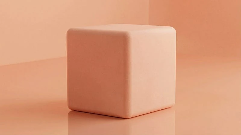
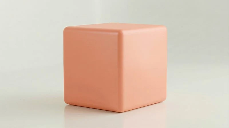
Peach Fuzz: Use this dusty orange-pink when a scene needs warmth without heavy saturation.
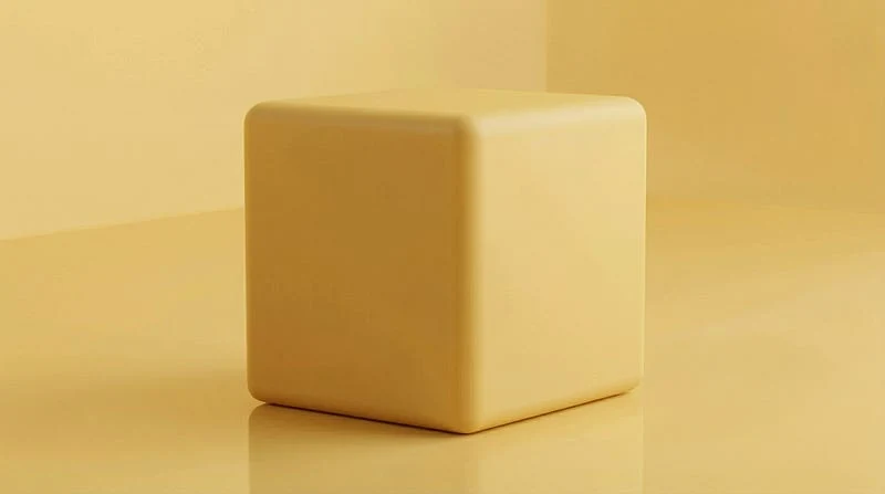
Butter Yellow: Use this creamy yellow for gentle highlights, cheerful backgrounds, and soft product scenes.
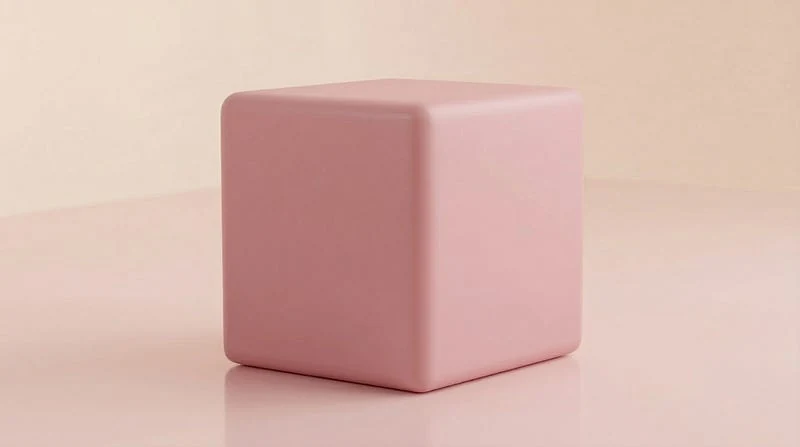
Millennial Pink: Use this muted pink when you want a modern pastel that feels calm and polished.
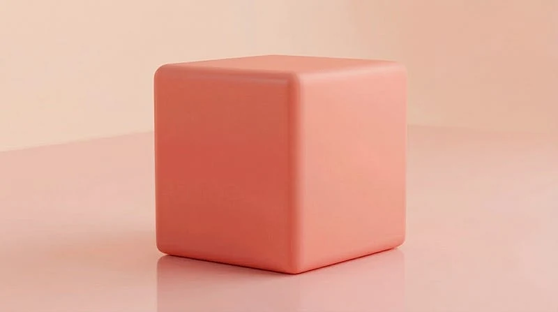
Coral Pink: Use this warm pink when a prompt needs a light floral tone with a peach edge.
Lemon Chiffon: Use this airy yellow for daylight, lace, paper, and spring scenes that need lift.
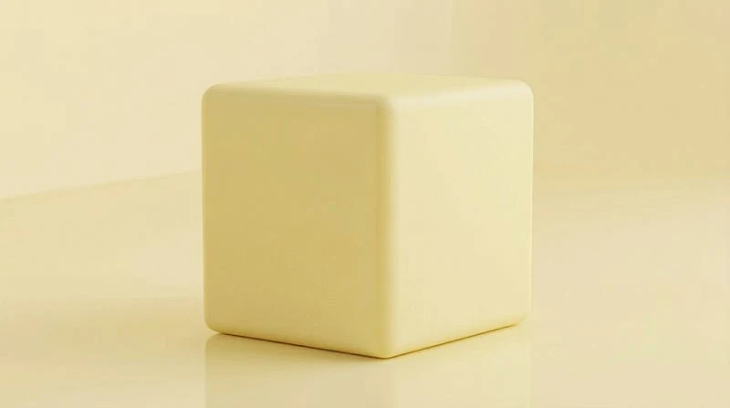
Rose Quartz: Use this pale crystalline pink for glass, gems, cosmetics, and delicate romantic images.
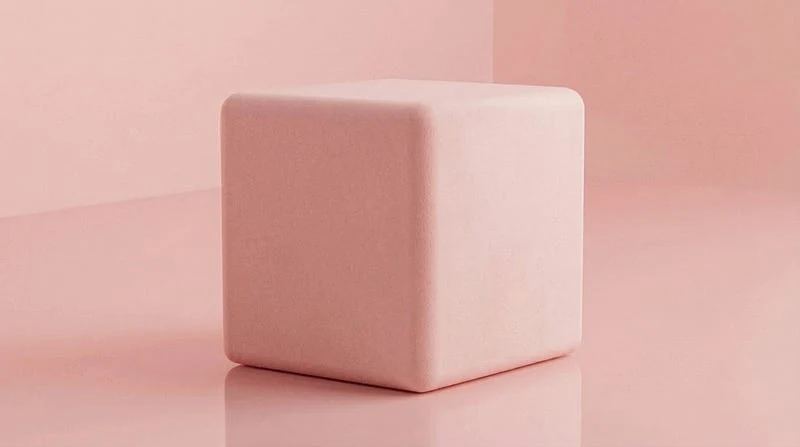
Blush: Use this near-pink tint for backgrounds, cheeks, petals, and subtle warm highlights.
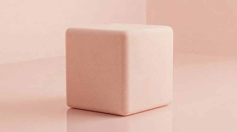
Creamsicle: Use this milky orange for playful food styling, retro details, and warm accent color.
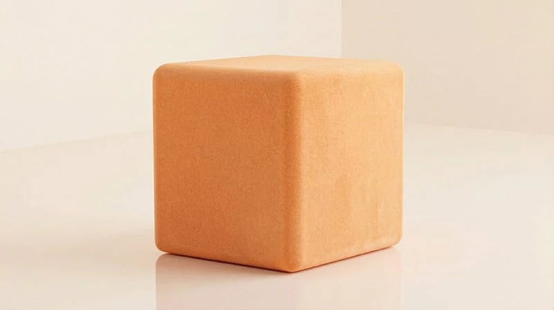
Dusty Mauve: Use this greyed purple when a spring palette needs a vintage or softened edge.
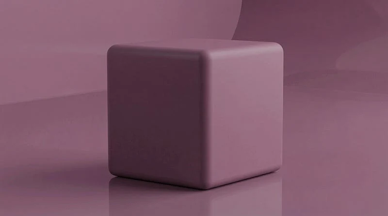
Melon: Use this desaturated orange-red for fruit tones, soft fashion accents, and warm abstract fields.
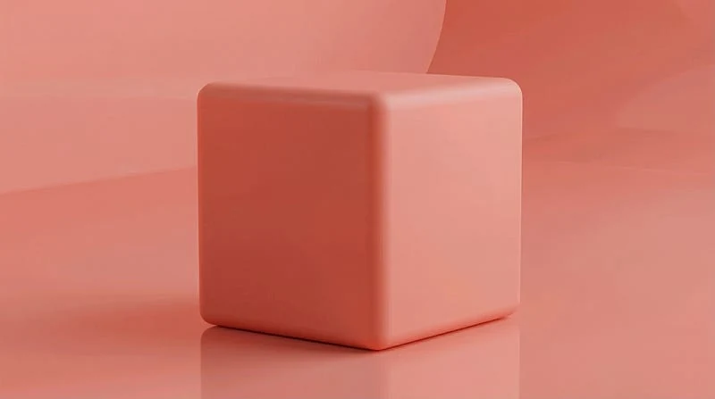
Vanilla Cream: Use this warm off-white to soften contrast and give pastels more breathing room.
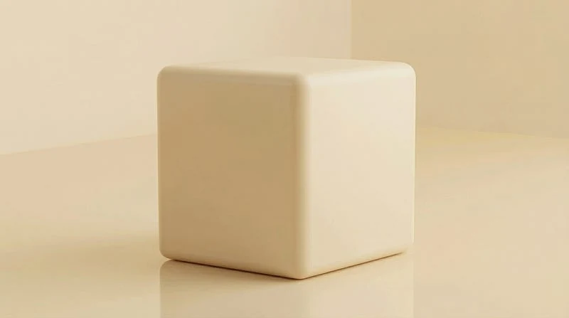
Pale Apricot: Use this dusty yellow-orange for skin-friendly warmth, ceramics, baked goods, and spring decor.
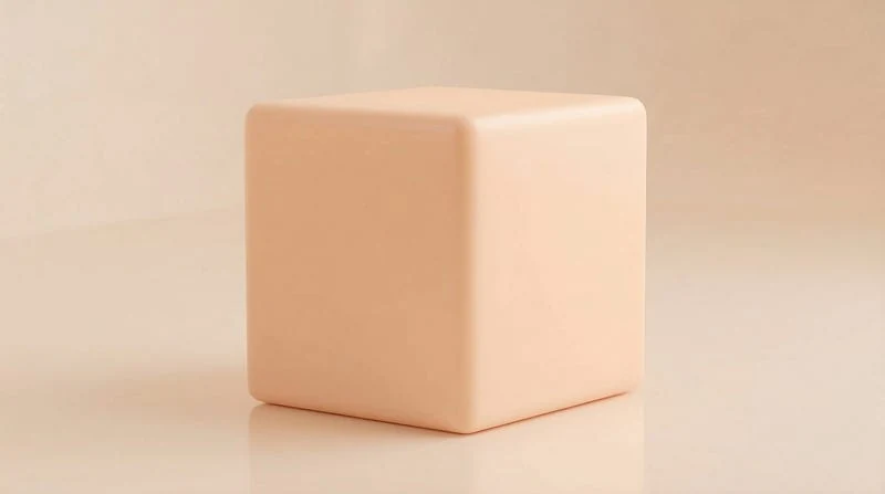
Orchid Pink: Use this cool pink when a prompt needs floral color with a violet tint.
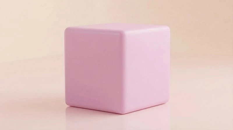
Champagne Pink: Use this warm pale pink for elegant packaging, soft interiors, and polished beauty shots.
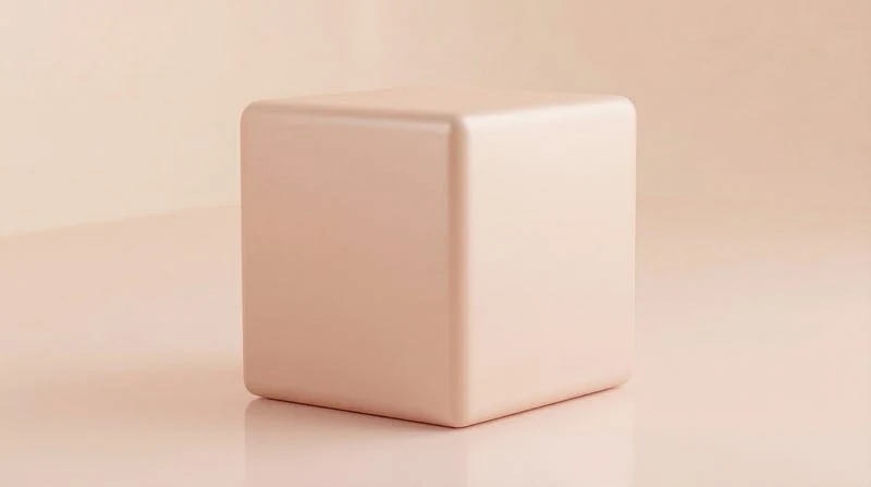
Honeydew: Use this crisp yellow-green for fresh produce, clean surfaces, and gentle botanical prompts.
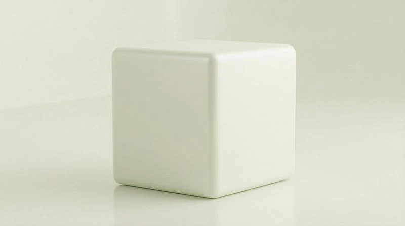
Pale Primrose: Use this cool light yellow for flowers, stationery, lace, and morning light.
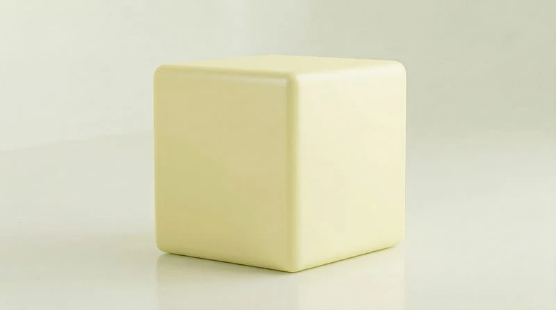
Salmon Pink: Use this pink-orange for warm flowers, soft gradients, and food-inspired color palettes.
Cool Spring Pastel Colors
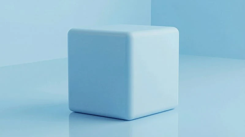
Baby Blue: Use this pale blue for clear skies, nursery color, clean product shots, and open backgrounds.
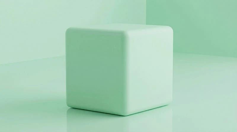
Mint Green: Use this light green for fresh packaging, spring leaves, spa scenes, and cool accents.
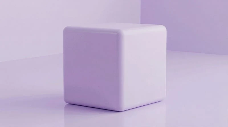
Lavender: Use this pale purple for floral scenes, dreamy portraits, soft fabrics, and calm fantasy art.
Seafoam Green: Use this blue-green pastel for coastal details, bathroom tile, airy glass, and botanical surfaces.
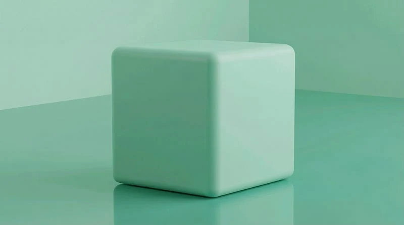
Periwinkle: Use this blue-violet pastel when a scene needs a cooler purple that still feels light.
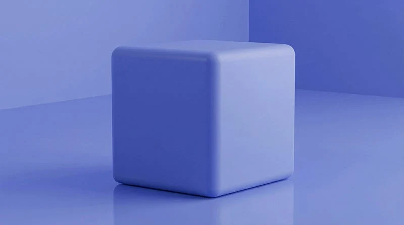
Lilac: Use this pinker violet for blossoms, spring dresses, painted rooms, and romantic accents.
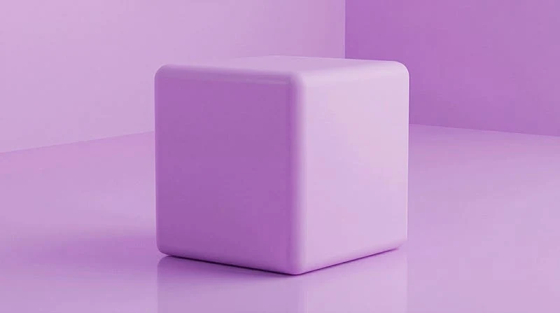
Powder Blue: Use this dusty pale blue for vintage packaging, soft skies, porcelain, and muted interiors.
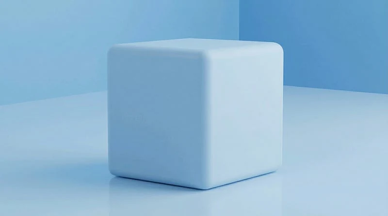
Pistachio: Use this creamy yellow-green for food styling, tile, painted wood, and soft plant color.
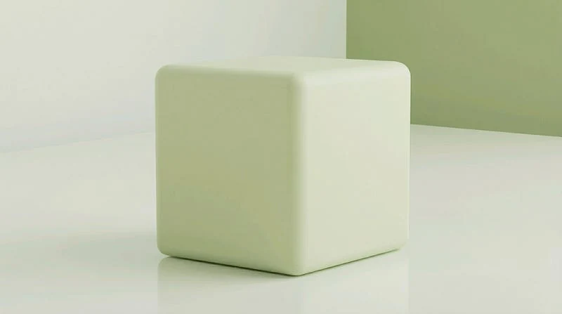
Iced Aqua: Use this frosty blue-green for water, glass, highlights, and clean sci-fi accents.
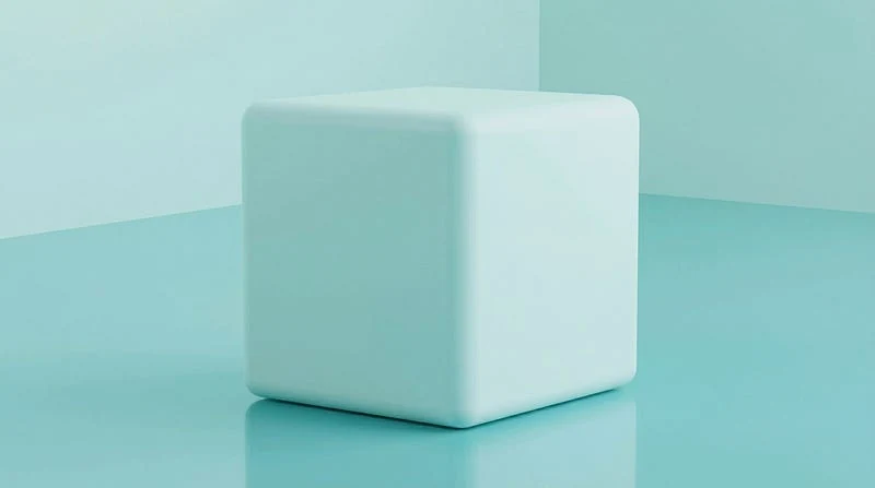
Iceberg Blue: Use this near-white blue for frost, porcelain, glass, and cold atmospheric haze.
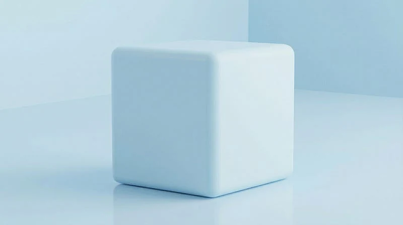
Celadon: Use this pale jade-green for ceramics, tea rooms, botanical design, and refined interiors.
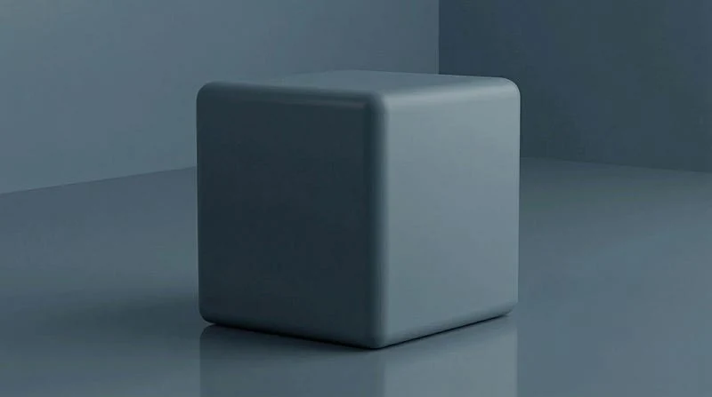
Duck Egg Blue: Use this muted blue-green for cottage interiors, painted furniture, and calm backgrounds.
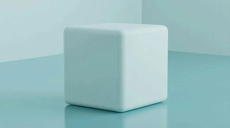
Robin’s Egg Blue: Use this soft cyan-blue for spring motifs, packaging, painted eggs, and clear accents.
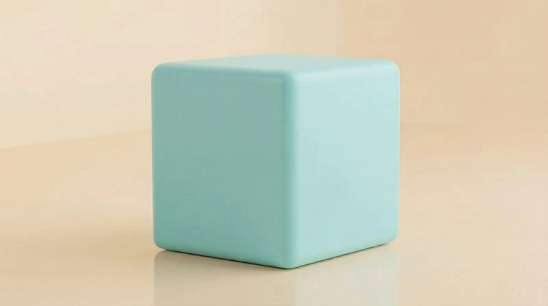
Pale Sage: Use this grey-green for natural branding, quiet rooms, botanical studies, and linen textures.
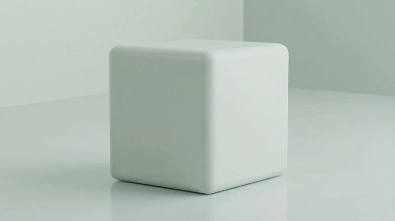
Frost Blue: Use this white-blue for crisp highlights, winter-to-spring scenes, and translucent materials.
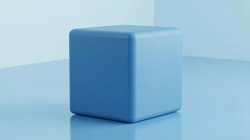
Wisteria: Use this dusty purple for hanging flowers, soft gowns, romantic lighting, and dreamy interiors.
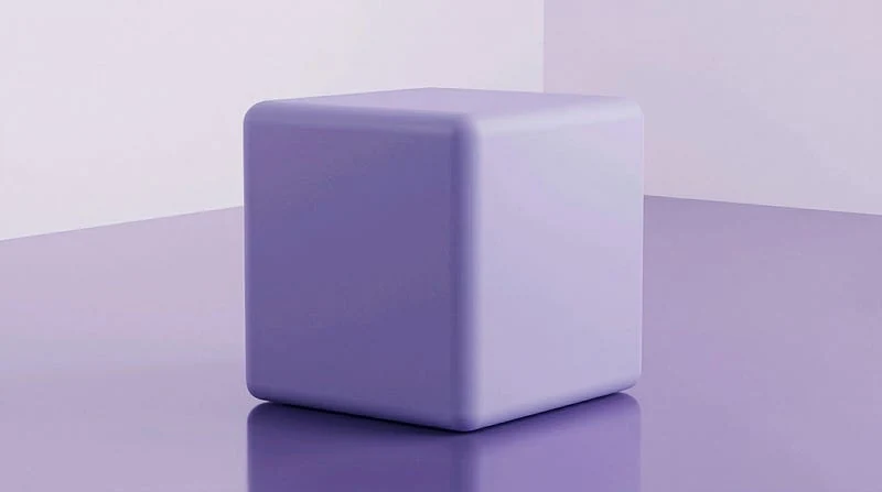
Thistle: Use this pale warm purple for soft floral work, vintage stationery, and muted fantasy details.
Ready-to-Use Pastel Palettes and Color Blends
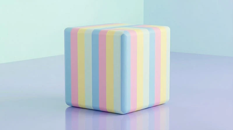
Cotton Candy Palette: Use this pink and cyan pairing for playful images, dreamy skies, candy themes, and cute design.
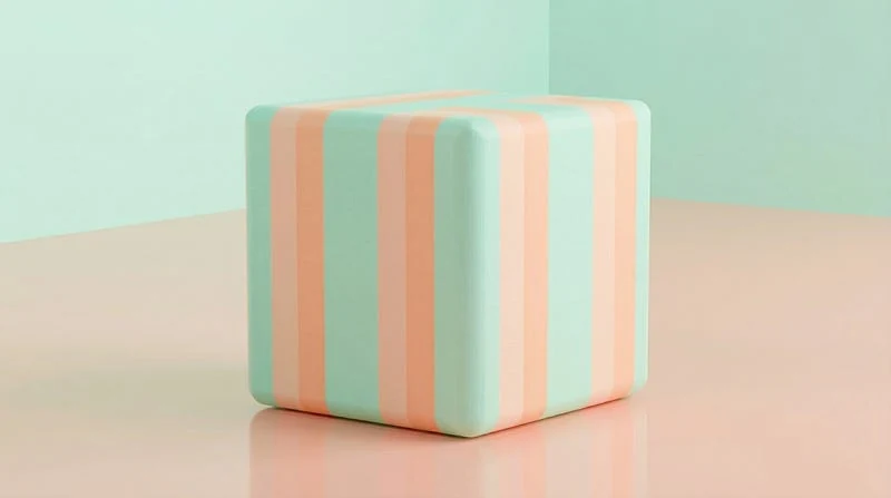
Mint and Peach: Use this balanced pairing when a prompt needs freshness and warmth at the same time.
Lavender Haze: Use this purple wash for romantic scenes, perfume ads, soft fantasy art, and hazy light.
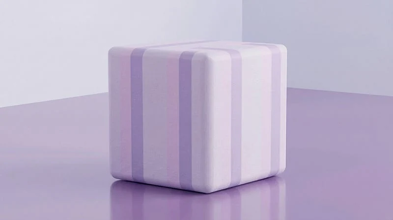
Sorbet Colors: Use this fruit-toned set for bright spring layouts, desserts, stickers, and playful abstract images.
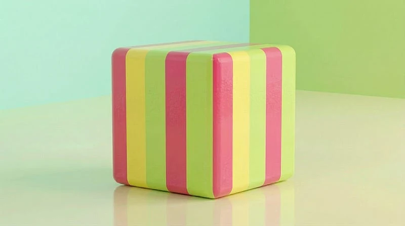
Neapolitan Gradient: Use this vanilla, chocolate, and strawberry blend for retro sweets, soft stripes, and food-inspired scenes.
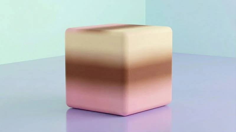
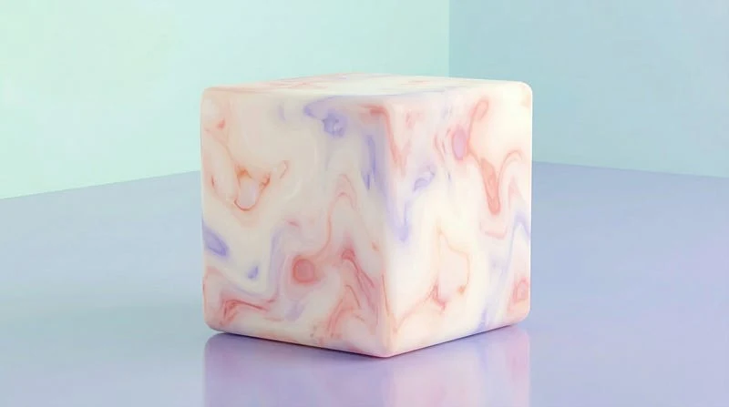
Pearlescent Iridescence: Use this shell-like palette for luminous surfaces, jewelry, glass, and soft futuristic materials.
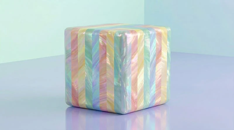
Muted Spring Tones: Use this natural set for early blooms, quiet gardens, pale leaves, and seasonal editorial design.
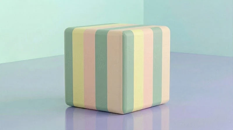
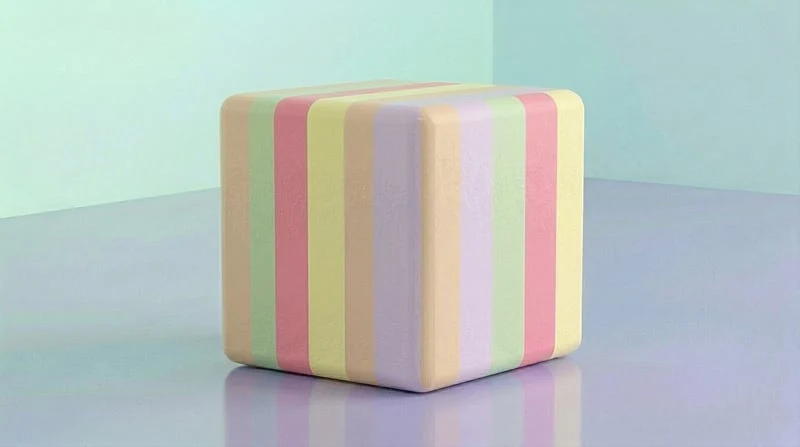
Macaron Assortment: Use this multi-color palette for bakery scenes, pastel grids, product spreads, and cheerful collections.
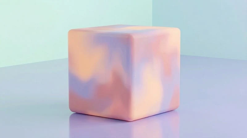
Pastel Sunset: Use this peach, lavender, and dusty pink blend for skies, gradients, posters, and soft glow.
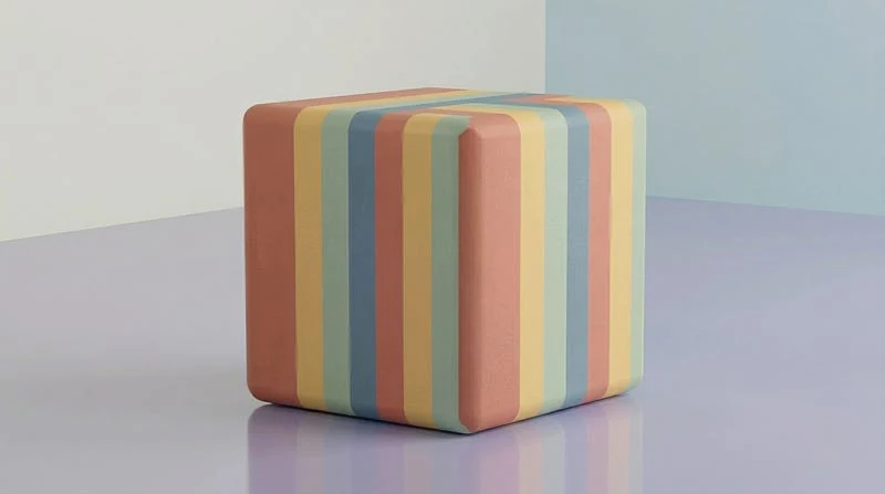
Earth Tone Pastel: Use this grounded set for sage, clay, terracotta, and organic neutrals that still feel soft.
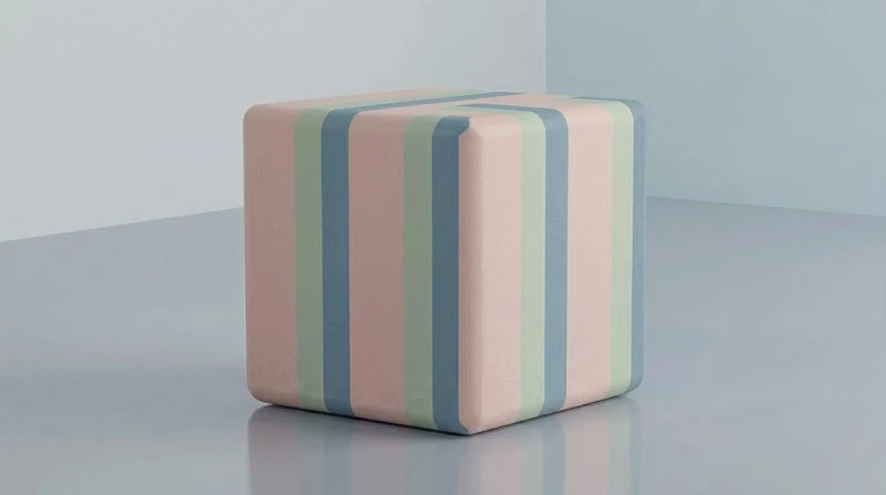
Nordic Pastel Palette: Use this dusty blue, pale sage, blush, and cool grey set for minimal interiors and clean branding.
Milky White Accents: Use this creamy white-heavy palette to separate pastel colors and keep a prompt bright.
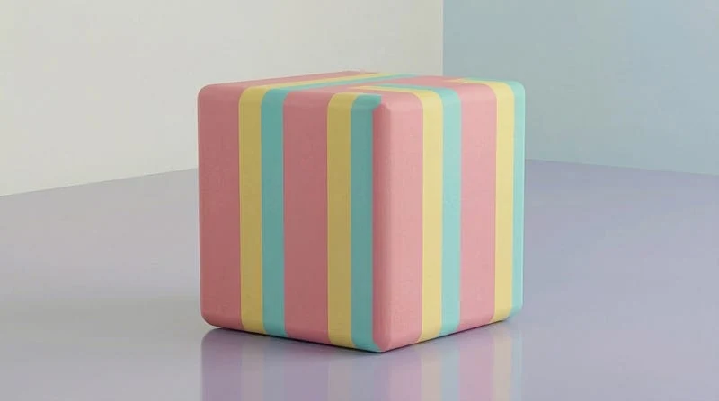
Miami Deco Palette: Use this pink, turquoise, and soft yellow mix for retro architecture, beach graphics, and neon-free nostalgia.
Published here first. This one never made it to Medium.